by Yiming Li
//This is a five-week project, longer than any previous undertaking. To ensure no ideas are overlooked and everything appears to unfold according to plan, this learning journal will be recorded strictly chronologically.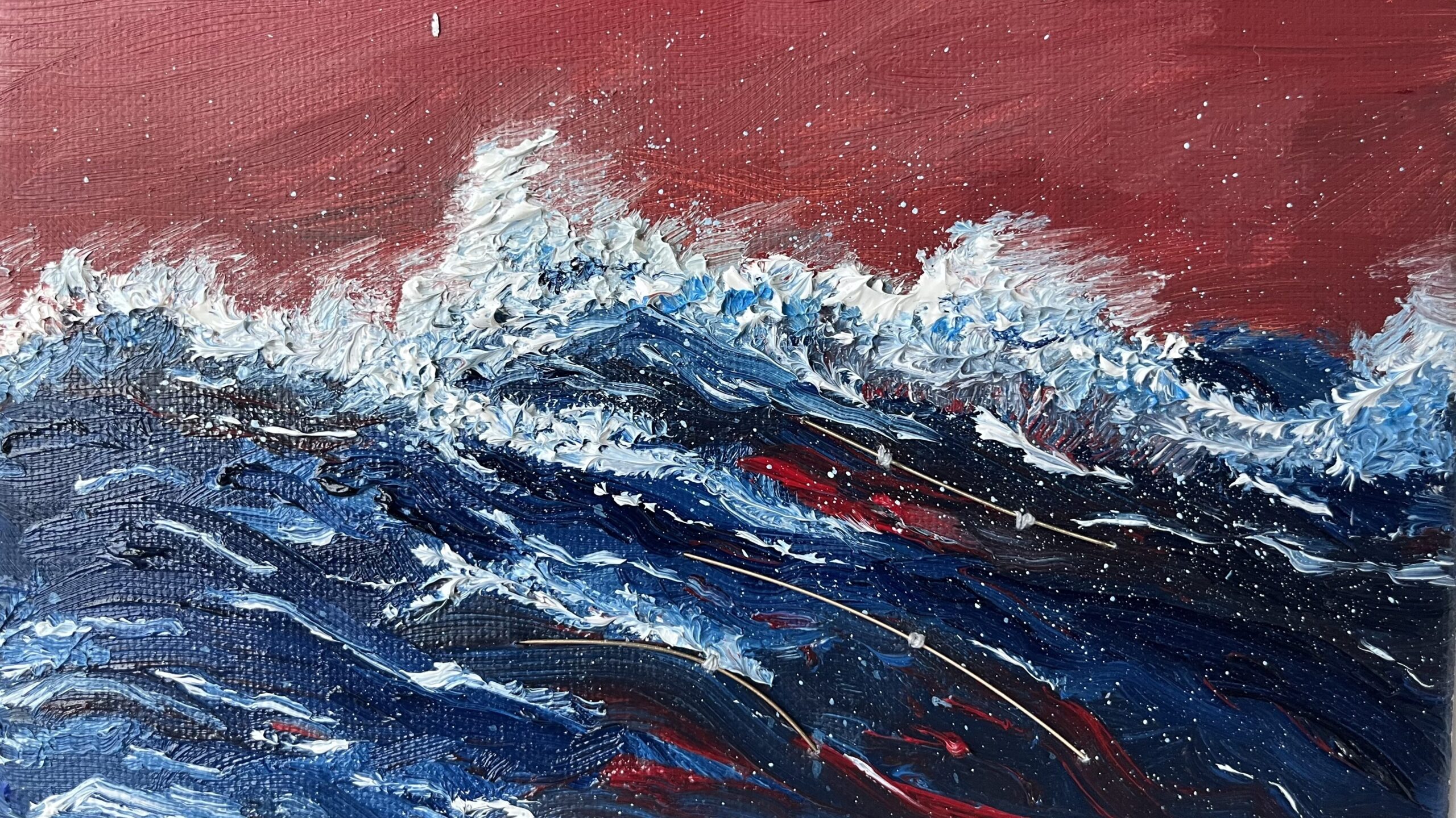
'Data visceralizations are representations of information rely on multiple senses including touch, smell, and even taste, working together stimulate our feelings as well as our thoughts.'

– Luke Stark, 'Come on Feel the Data (and Smell It)', The Atlantic, 19 May 2014.
Mapping one dataset onto another is one of the most common operations in computer culture and forms part of new media art. In this project, I explored multiple ways to visualise and physicalise data. My aim was to construct a data-driven art installation that connects data with the audience’s emotions and consciousness through powerful forms of expression. I prefer not to engage with complex social, political, or environmental issues, so I intend to begin with simple yet extensive datasets.
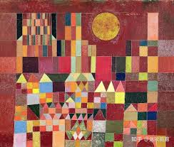
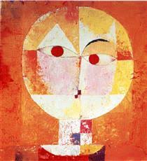
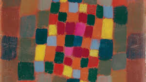
My research for this project has largely centred on visual and textual materials. Colour is synonymous with the visual, and humanity began exploring its connections to other substances centuries ago. Paul Klee, a nineteenth-century Swedish artist, frequently likened the structure of painting to that of music—polyphony, rhythm, melodic lines. His works possess remarkable chromatic tension, his style categorised as surrealist, cubist, and expressionist. This creative concept of treating a painting’s colours as a resonant composition struck me as profoundly intriguing, while also inspiring my initial ideas for this project. I sought to explore the “synaesthesia” of colour, investigating the visual rhythms and chromatic tensions generated by hues within diverse pictorial contexts, and to materialise these abstract sensations through various mediums.
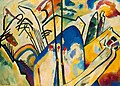
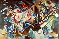
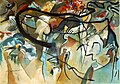
There exists a fascinating and enduring theme in both art history and psychology: the correspondence between colour and sound. Wassily Kandinsky, a Russian painter and art theorist from the 19th century, delved deeper into this exploration in my view. Kandinsky possessed synesthesia (a blending of senses), enabling him to perceive colours with distinct auditory clarity. This phenomenon profoundly influenced his artistic practice. He even titled his paintings ‘Improvisations’ and ‘Compositions,’ as though they were musical compositions rather than visual artworks. He believed colours possessed an ‘inner voice,’ with contrasting hues generating varying degrees of tension and contraction, akin to the effect of ‘chordal conflict.’ Compared to Paul Klee, Wassily Kandinsky’s works and theories, in my view, contain less abstract elements. They transcend material constraints and possess a greater sense of musicality.
Returning to the 21st century, humanity now analyses these colours not merely through the naked eye, but via more data-driven and precise methods. We have assigned attributes such as RGB and HSB, distinguishing and quantifying these hues through graded data. Yet what this data cannot alter is the potent correlation between these colours and sound; indeed, it renders these associations more precise, lucid, visualisable, and manipulable. Numerous works in contemporary art employ diverse techniques and media to sonify colour. Take the Analema Group at National Gallery X, for instance: by exploring the harmonious beauty within colour, they utilise binaural stereo and 360-degree spatial video to create immersive sonic experiences. Their foundational subjects for colour sonification often draw from renowned masterpieces, such as Monet’s Water Lilies, Sunset and Van Gogh’s Wheatfield with Cypresses. Yet in my own work, I aspire to break free from existing constraints, exploring certain colours or the relationships between complementary hues with greater freedom and whimsy – whether on a physical or spiritual level.
Following several preliminary workshops, my current approach involves selecting specific colours to compose visual sequences in my own manner. I intend to analyse their numerical attributes, such as RGB values, to generate sufficiently extensive datasets. Concurrently, I aim to create an auditory space capable of translating these visuals into sound through specific triggering mechanisms, such as touch. The five-week timeframe affords me ample opportunity to realise this installation, hence I have resolved to commence preliminary experimentation.
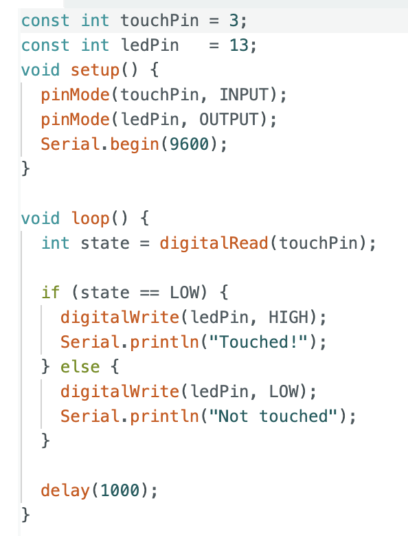
Now, I need to commence some experiments. I must select a suitable “medium” for touch detection and test their conductivity. Before proceeding, I require a brief refresher on Arduino methods for testing wire readings. I stripped one end of a wire, made a simple connection to the Arduino board, and wrote a short piece of code. The fundamental principle involves using the Arduino to detect whether an external wire is being touched by a human hand (detecting changes in human body capacitance), then displaying these changes via an LED or serial port output. When touching the exposed copper wire section, I could observe the readings change. However, this code is far too brief, with too many factors influencing the readings, so it cannot serve as the final code for testing connectivity. Still, it did help me review the underlying principles of this process.
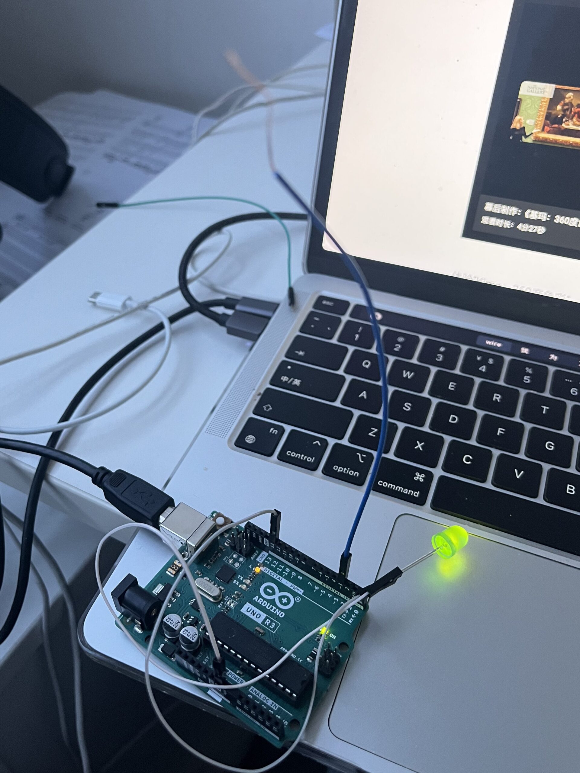
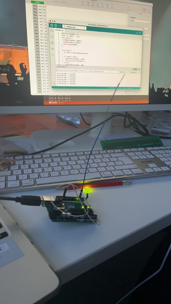
Today I continued with further testing. I brought along some entirely new materials—a few old guitar strings—and significantly optimised the code. Guitar strings, like the copper wires in jumpers, are conductive yet offer greater convenience and stability. Simultaneously, I realised it was unwise to directly use the Arduino to detect ‘current changes’. This may sound counterintuitive, but it simply isn’t how it operates. Attempting to measure current directly yields virtually no meaningful data. The human body acts as a natural capacitor and electric field coupling. Therefore, my sole requirement is to test whether this wire (or guitar string) has been touched. Before proceeding with these experiments, I must clarify that my objective isn’t merely to test the material’s ‘connectivity’—otherwise, I’d have simply used a multimeter and been done with it. My purpose is to obtain specific data, or rather, to determine what I can call upon in the future.
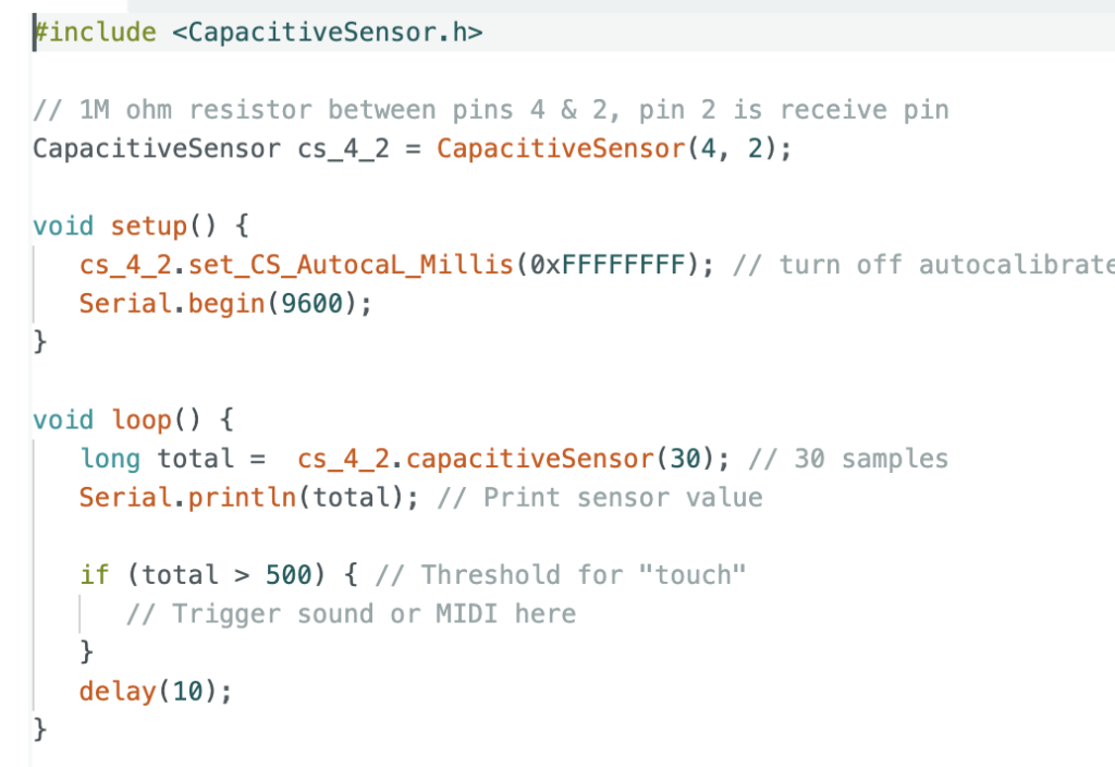
Today I tested two approaches. In the first code, I employed a rather simplistic method: attaching alligator clips to both ends of a guitar string, one end connected to the 5V port and a resistor of approximately 1-10 ohms, the other end grounded. This was simply using `analogRead` to detect High or Low, resulting in readings with significant noise. I realised there exists a more professional approach, particularly well-suited for interactive installations: utilising the CapacitiveSensor library. If memory serves, we covered this library quite some time ago. In any case, I briefly revisited its usage and rewrote the code. The underlying principle remained largely unchanged, except that one end of the crocodile clip now connects to the transmit pin, while the other end requires an additional receive pin instead of being directly grounded. Having obtained some data, this phase of the project could be temporarily concluded.
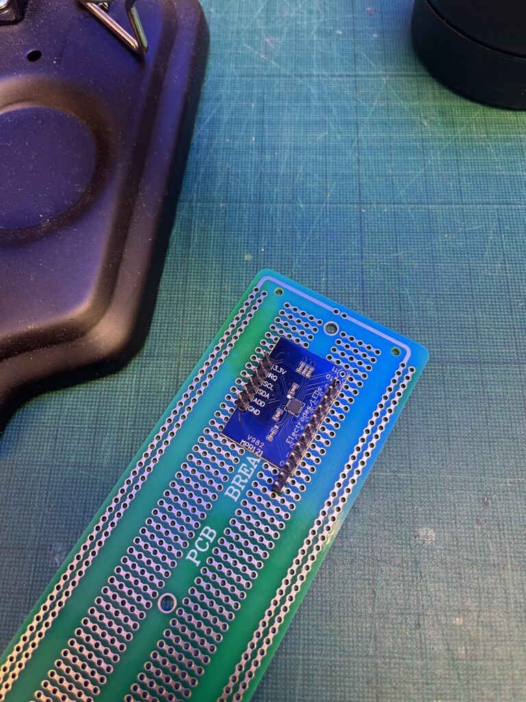
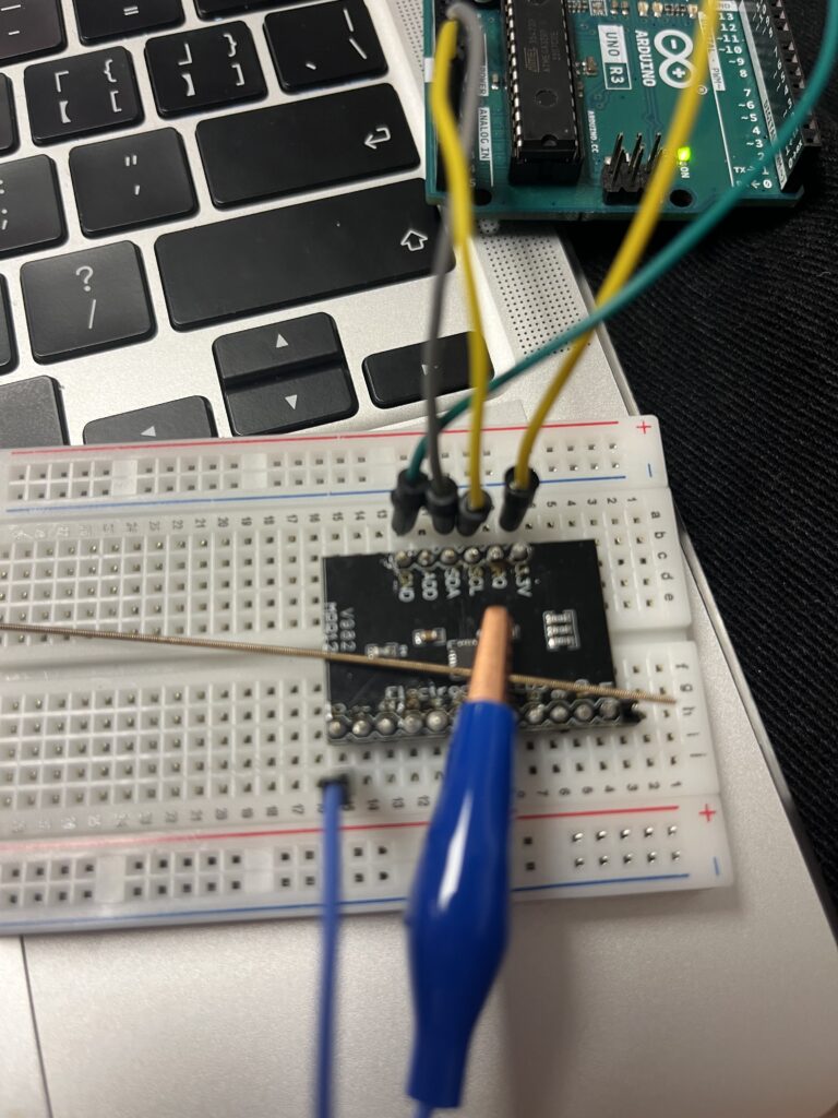
On the third day, I undertook further optimisation of the touch logic. I procured a more professional and efficient capacitive touch sensor module online—the MPR121. As a standalone component, it proved more stable, featuring twelve serial channels and remaining unaffected by environmental factors, thereby delivering clearer and more responsive touch feedback. I spent some time understanding its operation and performed some basic soldering to secure it firmly onto my breadboard. Subsequently, I continued with relevant testing and debugging. My code was derived from the example within the Adafruit MPR121 library, which functioned well within the Arduino IDE. Consequently, I attempted to connect the Uno board to Processing, employing the previously learnt “import Serial” method. After consulting my tutor, I wrote some concise code. I utilised four channels on the MPR121, each linked to conductive objects that could be touched. Using the data from these pins, I manipulated Processing to draw patterns. This step proved crucial, demonstrating the viability of my earlier concept: ‘Using Processing as the central processing unit, with Arduino solely providing touch signal feedback.’
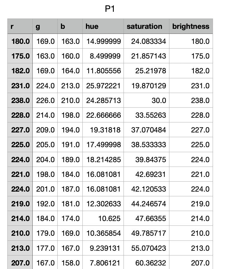
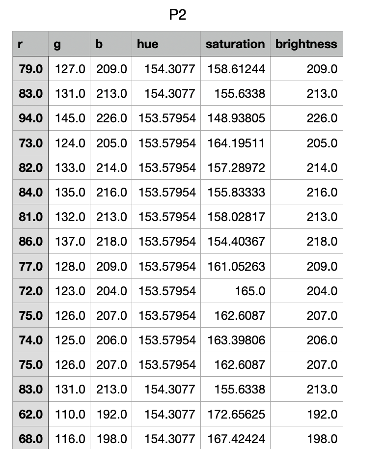
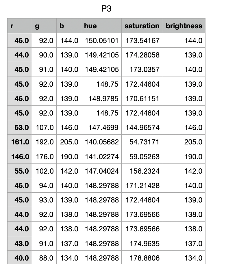
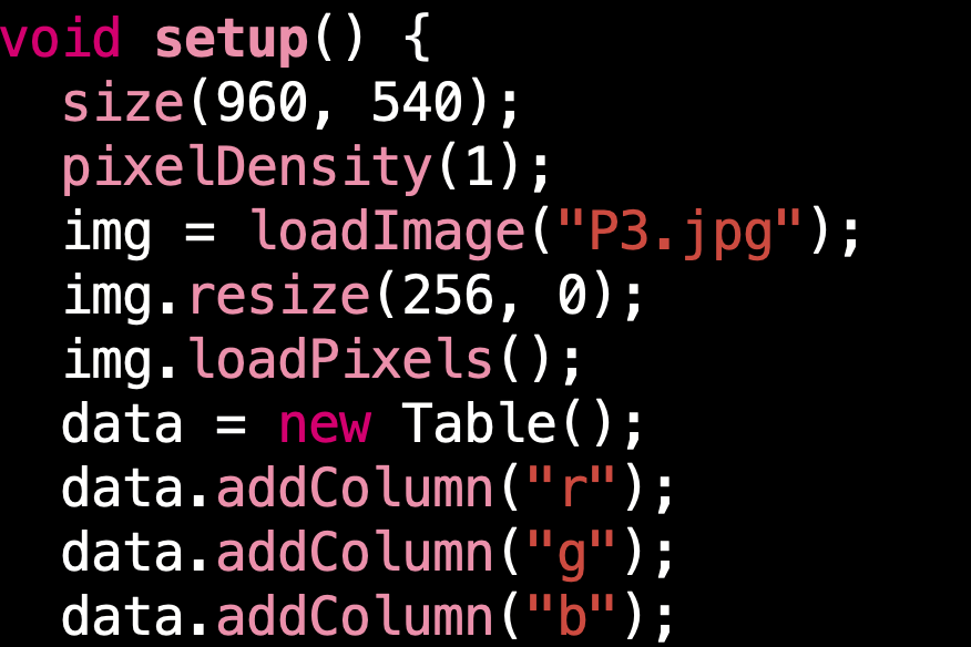
Regarding the visual presentation of the imagery, I have spent considerable time contemplating its form. What manner of visual should I create? Technically speaking, it ought to be literally “richly varied”, enabling me to obtain clear and dynamic colour data. Equally, this data should not be confined to simple RGB values but should incorporate hue, brightness, and saturation. This would allow me to produce a more natural sound mapping. The visual should be partitioned, with distinct colour combinations for different regions. Within Processing, I can utilise its capabilities to analyse the colour attributes of each pixel and automatically export a CSV file. I previously worked on this section under my supervisor’s guidance and should now further optimise this code.
By the third week, I had a brief discussion with my supervisor. To ensure the project adequately met the brief, I needed to optimise certain structural elements. I didn’t require radical overhaul—indeed, I retained many elements, including hand-drawn imagery, touch sensors, and the CSV file containing colour data. I merely needed to update the relationships between them, while also introducing entirely new approaches. I opted to use the midibus library for interfacing Processing and Ableton, acknowledging that I’d inadvertently overcomplicated this aspect in my initial conception. Broadly speaking, I shifted the project’s overarching concept from ‘Paint–Colour–Sound’ to ‘Human perception–Data–Transform–Sound/New Artwork’. Overall, I’ll avoid using any real-time data in subsequent production stages; I’ll explain the specific workflow later.
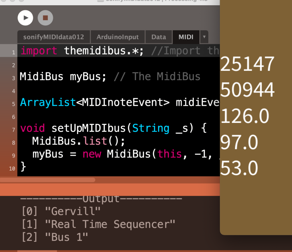
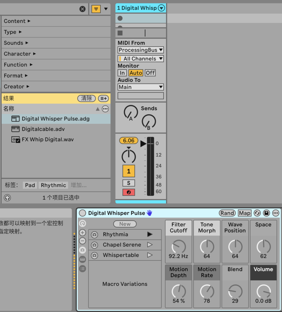
During the previous workshop, I learnt how to utilise a virtual MIDI interface to enable Processing to manipulate sound sources and their various data variations within Live 12. I combined this section of code with my earlier pixel analysis code, essentially converting colour data from images directly into digital MIDI signals that Live 12 can interpret. This proved highly intriguing, prompting numerous experiments. I could directly manipulate these variations by altering numerous functions within the code, such as extending or shortening the Delay to change the frequency of the sound. Additionally, I could instruct Processing to analyse HSB data instead of RGB data. Furthermore, if an image contained thousands of pixels, I could modify the index function to have Processing begin its analysis from different positions within the image. Simultaneously, within Live 12, I could experiment with altering different timbres and testing various internal sound sources to explore their varied effects when integrated with Processing. This proved highly engaging; I trialled numerous sound sources and made rough notes on several I found worked exceptionally well with this data. Having previously only used this software for audio recording, I hadn’t anticipated its capabilities in this manner.
Next, I intend to proceed with basic assembly and experimentation. In my conception, this project comprises multiple interconnected scenes. After sketching them out, I shall arrange them sequentially, capture the colour data from each frame, and utilise this information to provide feedback for certain interactive behaviours. I have initially sketched a small scene as a demonstration piece, incorporated it into Processing, and connected the Arduino wires to test their functionality.
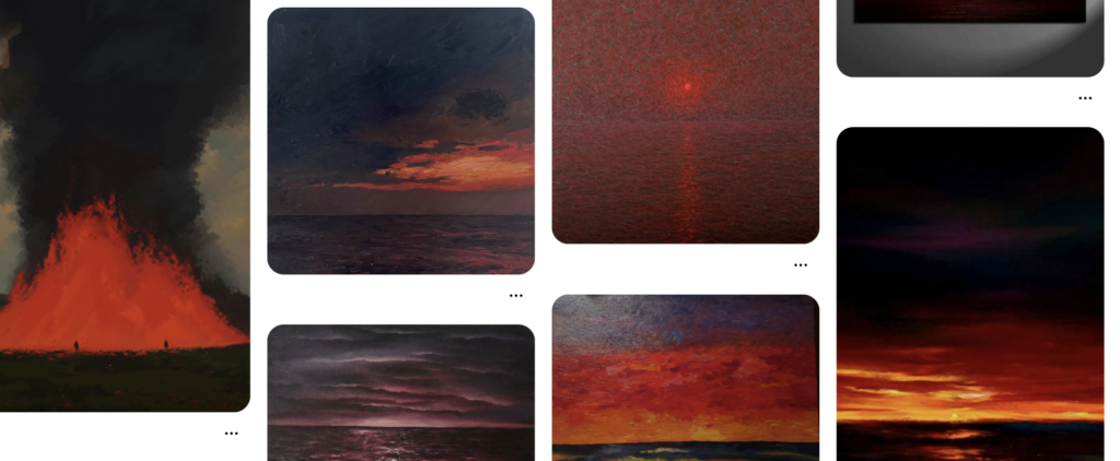
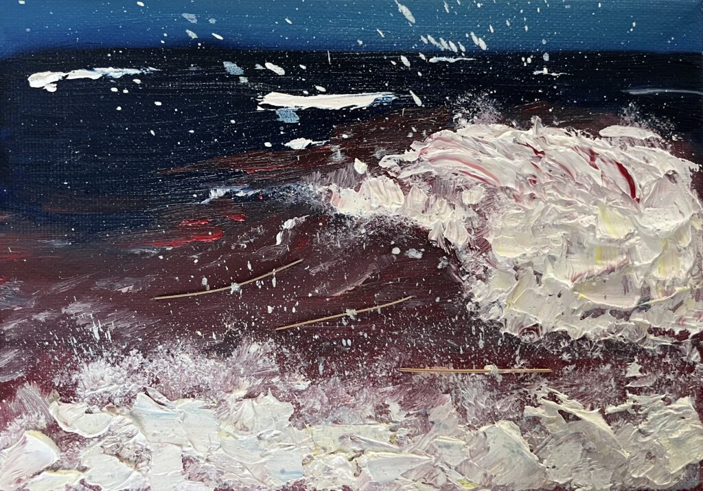
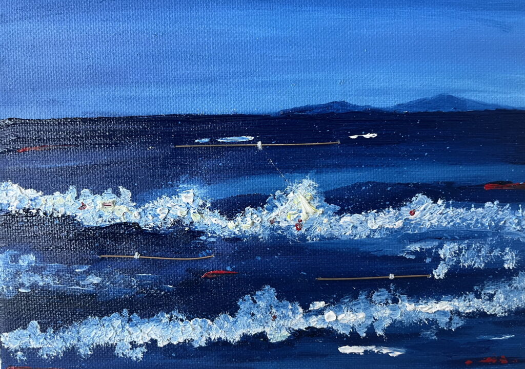
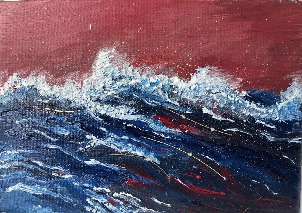
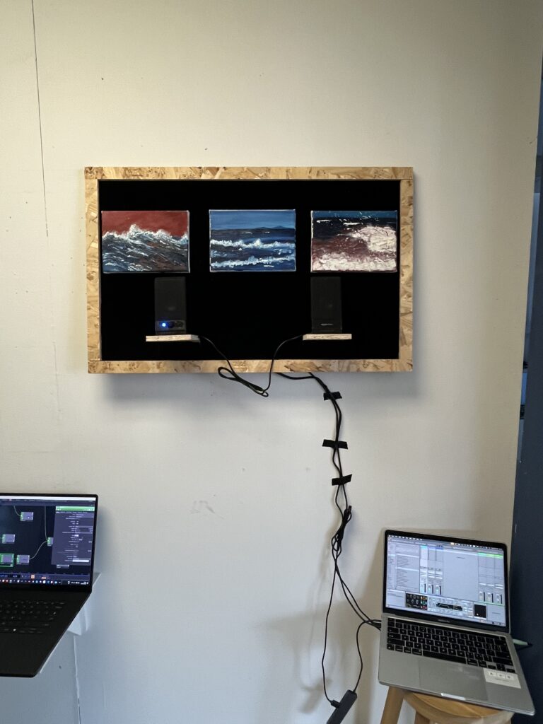
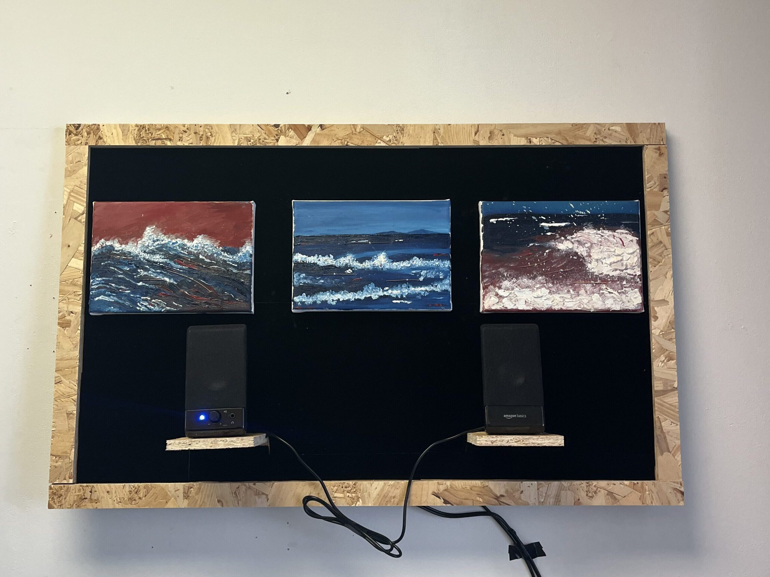
Regarding these paintings, personally, I wish to depict something engaging. I do not want them to be tedious, merely stacking colour blocks to pander to the central theme of colour transforming into sound. To some extent, I want them to be a little “jarring”. I hope the viewer first “sees” this work, and only then “feels” it. The image serves the work itself, yet it should not be an accessory. I gathered much inspiration from Pinterest, using keywords like ‘burning, boiling, waves, desolation’. These were my earlier reflections; whenever I discussed them, the sights and sounds I’d witnessed would materialise in my mind and leap onto the paper. For me, many things—life, purpose, obsessions—blend into a landscape of desolation, and at the edge of this desolation lies a boiling sea.
I employed extensive use of Prussian blue and deep red—two highly contrasting hues—as prior research and my own observations indicate this pairing inherently possesses a distinct “sonic quality”. In other words, this visual discordance serves as the primary source of rhythmic variation within the audio composition. Wassily Kandinsky conducted profound studies into this “synaesthesia” of colour, once proposing that “colours are the piano keys, the eye the hammer, the soul the string”. Applying his theory to my work: from a physical, material perspective, blues and reds of varying brightness and saturation resemble electromagnetic waves of differing wavelengths (though this analogy is imperfect). Red’s longer wavelengths correspond to bass frequencies, while blue’s shorter wavelengths mirror treble tones. Thus, a colour’s ‘wavelength’ parallels sound’s ‘frequency’; From a psychological perspective, or the realm of the mind, plain blue evokes bass tones, sustained notes, reverberation, and depth, while deep red conjures drumbeats, pulses, explosions, and brass instruments. This inherently adds a sense of vibration and instability to the audio, subtly enhancing the visual and auditory tension within this project. One intriguing observation from my research is that the actual perception of these two colours in physics and psychology often contradicts each other (dark blue is physically associated with high frequencies, yet psychologically people instinctively perceive it as belonging to the low register). This seems counterintuitive and difficult to explain, but I believe it is precisely what makes this kind of art so fascinating.
I chose to maintain a high degree of thematic and chromatic consistency across these three paintings because I wished for sound to be the true variable. Given that my research centres on the realm of sound, I felt it necessary to constrain visual variables to prevent them from overshadowing the subject. Had I employed entirely different themes, viewers would have been distracted by the pictorial narrative. Similarly, at the data level, employing similar colours across these three paintings allows me to obtain more closely aligned colour data. This implicitly constrains variables, enabling me to focus attention on the data itself. I can then analyse their relationship to sound from various angles represented by RGB and HSB – rhythm, frequency, spatiality, distortion, and so forth. From a curatorial perspective, this design imbues the work with structural coherence, enhancing the viewer’s immersion. (I shall certainly exhibit it.) By introducing subtle variations within these three images—such as the ratio of red to blue, the degree of fragmentation versus concentration in different hues, or the state of the sea (more turbulent or serene)—these structural distinctions become the basis for sonic transformations.
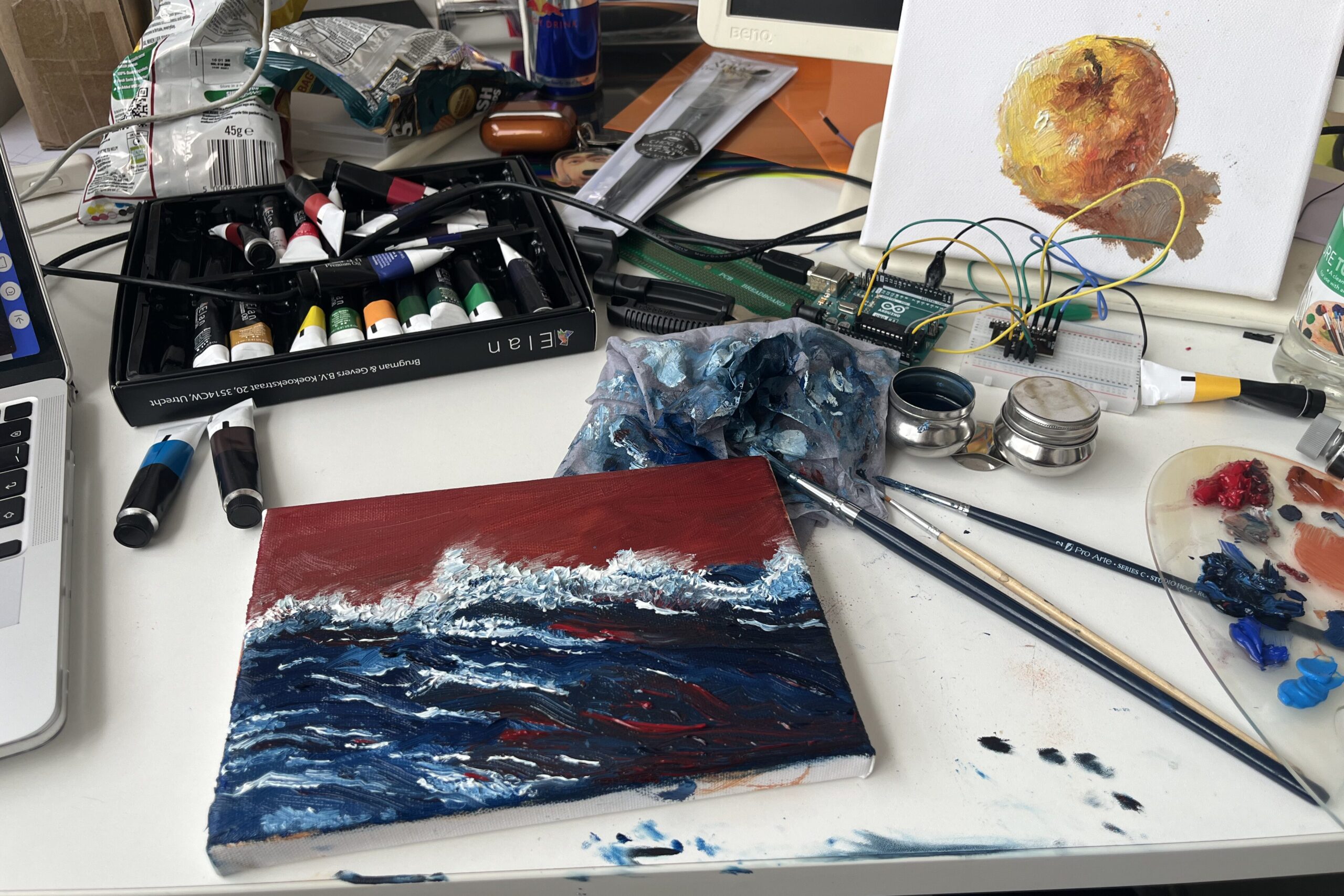
Returning to the production process, I completed the rendering of these three paintings and fed them into the previously developed Processing automated analysis programme. This yielded three CSV files containing the RGB HSB data for each painting. It seems worth noting that this programme operates by analysing the pixels row by row, starting from the top-left corner (origin 0) of the image and progressing until it reaches the bottom-right corner’s final pixel. Consequently, the data I obtained followed this same sequence. Similarly, the resulting sound played back would adhere to this order. I found this rather neat, as it inadvertently saved me some trouble. I wouldn’t need to reschedule the pixel data, and it would also lend the final sound playback greater logical coherence.
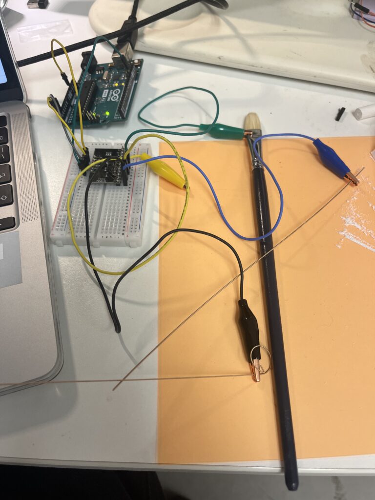
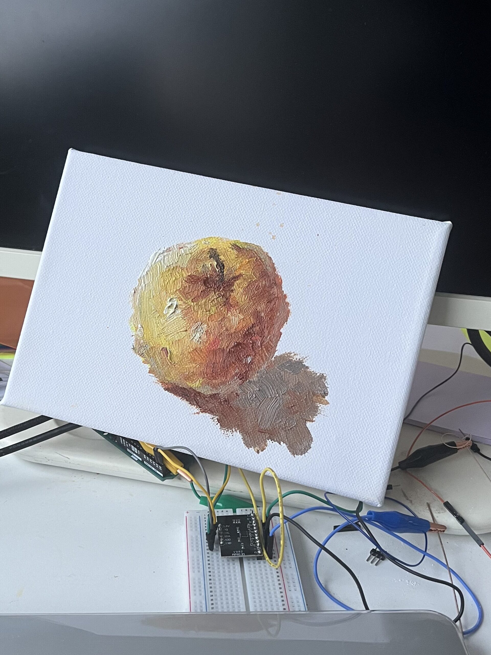
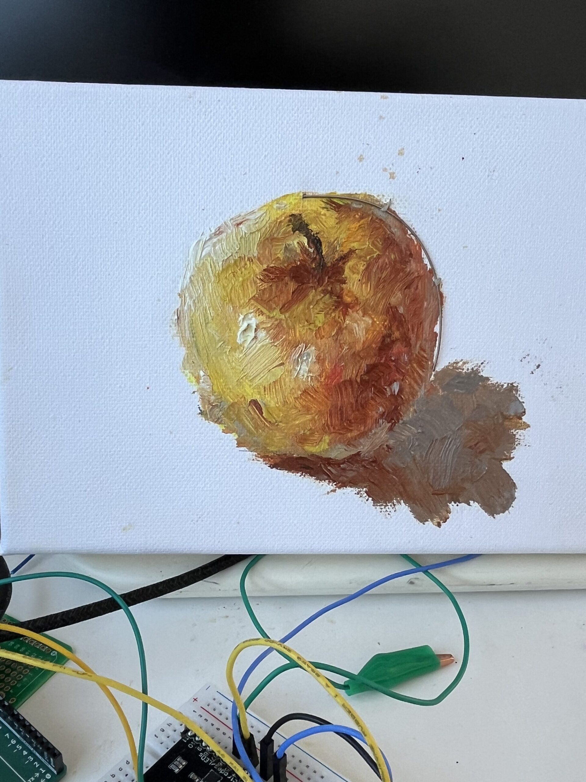
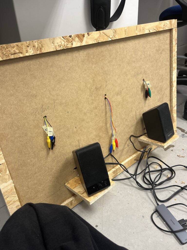
I cut the guitar strings into small segments and embedded them into the paintings, securing them with needle and thread. What strikes me as truly remarkable is how seamlessly these guitar strings appear to blend into the artwork—perhaps due to the brass texture, or the verdigris patina upon them, who can say? I allowed a small section to protrude from the reverse side of the paintings, enabling me to clamp them with crocodile clips and connect them to the Arduino board.
Next, I imported this data into Processing’s playback code. I also reworked this code. Since we now needed to incorporate the Arduino section’s ‘control switch’, it couldn’t simply play the data automatically from top to bottom; it required a logical start and stop. This part took some thought, as I had three paintings. Without any organisation, their triggering logic would become rather chaotic. In short, I ultimately settled on a logic where they would ‘begin playing upon trigger, with all three audio channels linked simultaneously. They could play concurrently without interference, while the last triggered channel would continue playing until the end.’ This approach minimised confusion while allowing me to explain the installation’s operation more clearly during demonstrations. Regarding the ArduinoInput section in the code, I initially employed rather clumsy methods. With my supervisor’s guidance, I’ve significantly optimised this, resulting in a much cleaner final code.
Regarding the audio section, during discussions with my supervisor, I incorporated some new (though not entirely novel, but crucial) concepts. Within audio host software, sound sources and instruments are categorised into two types: monophonic and polyphonic. Monophonic instruments can only produce one note at a time; pressing a second key will cause the first note to be overridden. These are typically used for bass or solo instruments, as one wouldn’t expect a bass to play triads. Polyphonic instruments, however, can play multiple notes simultaneously, enabling them to perform chords. Examples include pianos and string instruments. (Of course, some sound sources offer switching functionality, but we won’t delve into that here.) In my project, the R, G, and B data points represent three separate notes. If I genuinely wish to play the chord formed by these three notes, I must select a polyphonic sound source. I hadn’t paid much attention to this aspect previously. If I had selected a monophonic sound source, Ableton would always play the last note – in this case, the “B” data. Ultimately, for the three MIDI channels, I selected a string instrument, an audio sample, and a drum machine respectively. The aim was to demonstrate the differences these instruments produce when driven by similar data.
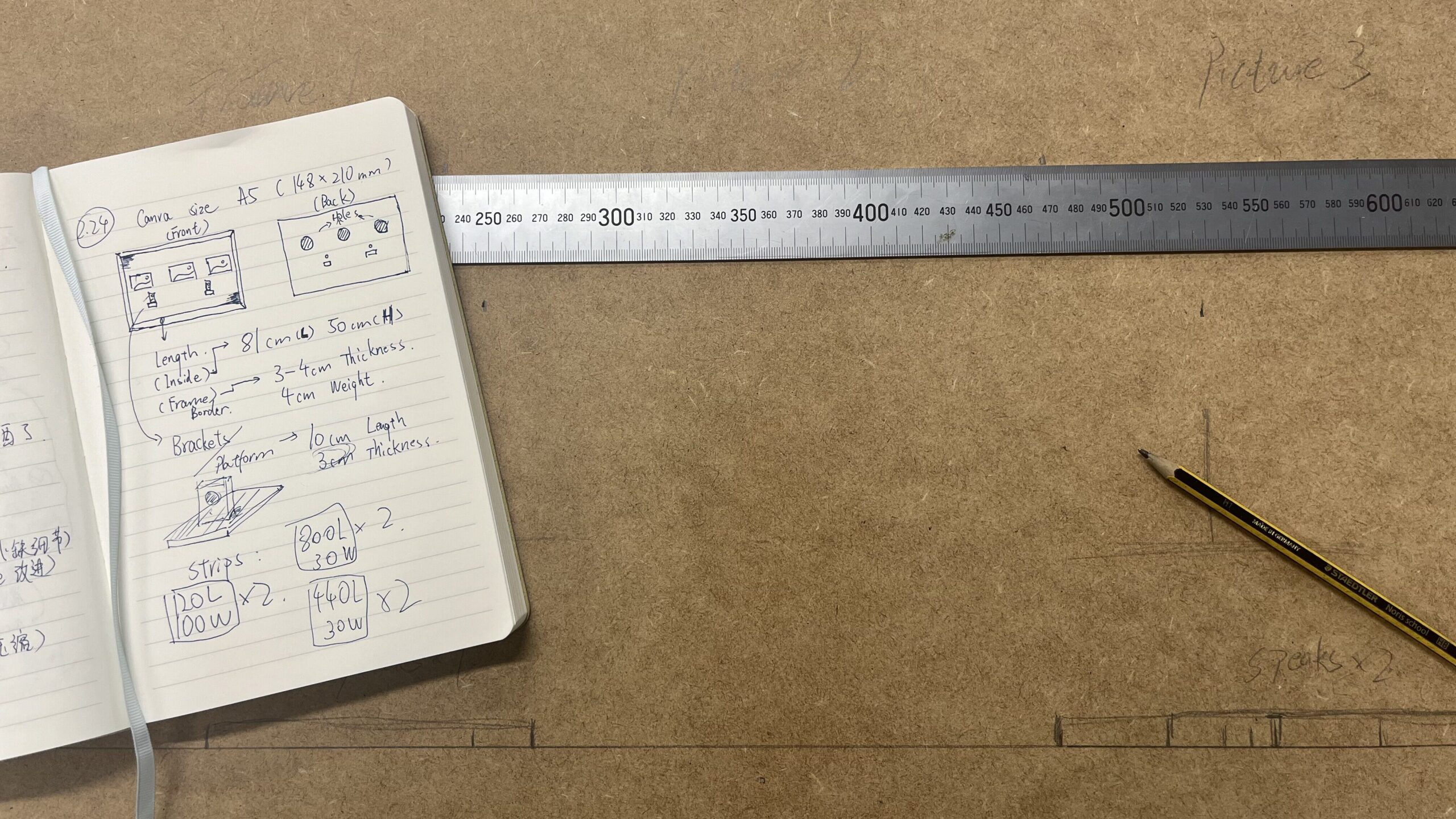
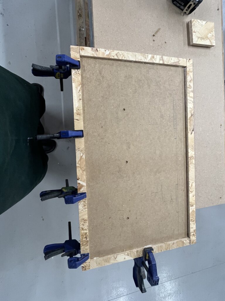
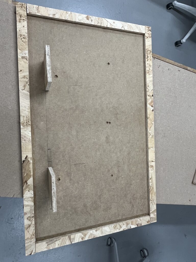
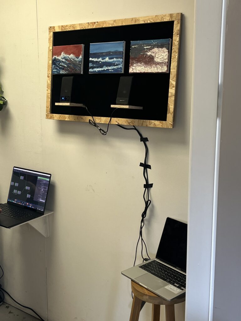
I began contemplating how to construct a suitable platform to support all the equipment, images and cables for this project. Or rather, how I should present it if I were to exhibit it. I planned to make a picture frame incorporating my three images and two speakers, with all the cables concealed behind. On Wednesday, I visited the Woodenwork workshop at Reid and spent some time constructing this picture frame. Unfortunately, most of the workshop’s machinery and electric saws were out of order that day, so I could only perform basic tasks with a hand saw. The finished frame wasn’t particularly pleasing to the eye, but it was the best I could manage at that stage. I completed the front section and two wooden platforms to support the speakers, drilling holes for the cables to pass through. I brought the finished piece back to the studio. Before assembling it, I need to complete one final step: attaching some felts. These black felts are akin to the acoustic foam you’d affix in a rehearsal room. In my future vision, this frame will be larger, requiring ample space at the rear to accommodate all the equipment and gear. This will inevitably create some excess space and voids. These speakers generate significant audio resonance when active, and I didn’t want them to vibrate the entire structure or produce unwanted echoes. The black felts help minimise interference while focusing the sound forward—towards the audience.
But to be honest, I’m not particularly fond of the picture frame concept. It feels like it’s constraining the entire project—I dislike such rigid boundaries. I feel that the material of these wooden panels and the placement of the speakers create distractions for the audience, forcing me into a lot of pointless overthinking. I wish it could simply appear cleaner and more straightforward. Perhaps only these three paintings should be hung on the wall? Time is limited, and this is the best I can manage for now, but at least it allows me to experiment with some ideas. I need opportunities to learn through trial and error.
Before the review presentation. To be honest, it wasn’t until I actually hung it on the wall that certain ideas truly crystallised. I enjoy mounting things on the wall, stepping back a couple of paces, and viewing them from a distance – it invariably yields fresh perspectives, new objectives, and novel reflections. I longed to see this project in a more refined, mature state. By integrating some of my earlier divergent explorations and experiments, the future vision for this project gradually came into sharper focus.
A long time ago, probably around the second week of this project, I experimented with something new—an eye tracker. I was fortunate that the studio had such equipment available; I could absolutely use it to create something truly fascinating. My initial concept involved tracking viewers’ eye movements—where they looked—and tracing curves or patterns along their gaze paths. Ultimately, I didn’t use it because it provided data more suited to real-time applications, which conflicted with the project brief. There were also some hardware compatibility issues, but it remains a brilliant piece of kit. I’ll definitely give it a go in future.
At the same time, if I had more time to devote to the audio, I’d also explore entirely different avenues. These ideas stem from feedback during reviews: when you interact with these paintings and they play sounds, you can actually discern the audio’s progression—like which row of pixels is currently being played. Hence, I want these sounds to be more expressive and impactful. Reworking the logic of each trigger. It’s like a wall of sound, or shoegaze music à la My Bloody Valentine – imagine these sounds overwhelming you. I was already creating something emotive, so the sounds they produce should be more emotionally charged too. I’ll place them in one spot or hang them on the wall, where they can loop endlessly, layering sounds until the very end.
In the future, I hope this project will become a medium linking traditional painted images with human thought through digital devices. Imagine me conveying messages through patterns; the viewer’s responses would then be transmitted back to the project via these devices and wires. I would collate and visualise them—when you stand before these three patterns, every minute action: looking, listening, thinking—all take on meaning for me.